Spring is here in the northern hemisphere, which means it's time for the annual American Association of Physical Anthropologists and Society for American Archaeology meetings. Pet sitters and rides to the airport were frantically arranged as nearly everyone in the building has flown to either Austin, Texas or Washington, DC. Another surge in activity was dedicated to getting posters printed in time for either meeting.
Academic posters are typically used at conferences and other such meetings to practically and concisely convey information about a project to a fluid and often wide-ranging (age, speciality, language, etc.) audience. Posters are so important to academia that there are dozens and dozens of papers and blog posts/tutorials written about them; some even offer templates. One published in Annals of Medicine and Surgery provides a rather basic guide to preparing an effective academic poster, but we in the Perry Lab have our own preferences that I would like to share with you.
Why should you listen to us? Well just check out these two beauties, designed and presented at AAPA2018 by undergrad Audrey Arner and PhD student Maggie Hernandez. Maggie even won a graduate student poster award at PSU's Anthropology Day last week! I can only hope my poster for Evolution 2018 will be as lovely and potent as theirs.
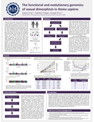 | 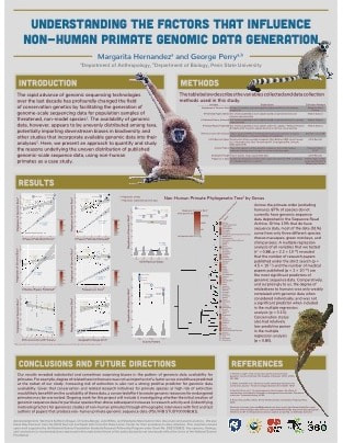 |
Click the images to see a full-scale PDF version, courtesy of Audrey and Maggie. Thanks guys!
| Tools | Lots of people prefer to craft their posters with Microsoft PowerPoint or Apple Keynote, but lately we've been switching over to Adobe Illustrator or InDesign to have a bit more precision with our formatting. |
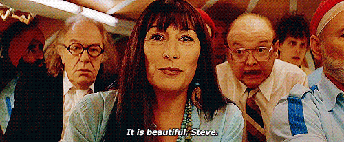
| Design | A classic mistake in poster design is overdoing it. Keep everything as simple as possible, from your column structure to your fonts. Most of us have switched to a vertical poster format since Maggie shared some of her poster inspiration with us. We think having two major columns instead of three makes the visuals easier to align and text to read in a more natural way. A few of us (alright, maybe just Steph Marciniak and I) are also turning to the works of Wes Anderson for our color palettes. I'll be using colors from The Life Aquatic with Steve Zissou for my conch poster in August; seemed rather fitting to me. |
| Fonts | Fonts are so important that they are going to have their own section here. MAKE SURE ALL OF YOUR TEXT IS LEGIBLE! No hard and fast rules here, but font sizes <18 pt probably should not be included on a poster. I tend to prefer sans-serif fonts because they feel cleaner to me, and I've been finding some really nice-looking ones on Google Fonts. Bonus, these are free and lots of people have already come up with elegant combinations of fonts for you! |
| Heading | Titles should be short in length, simple in language, large in font size, and eye-catching. Your audience should know exactly what they are going to learn from reading your poster. It is also important to give credit where credit is due, and include every author that had something to do with your poster presentation. |
| Content | Gundogan et al specify Introduction, Methods, Results, Conclusions, and References as important sections to include on your poster, but another helpful section to include is "Future Directions". People often want to know where you are going to go with this work, and if you include those details on your poster then your audience can get that information even if you are not present at the time (everyone needs potty breaks after all!). |
| Printing | Keep your resolution high on figures and images - blurry posters create no joy. Leave yourself enough time to print your poster, especially if you'd like to order a cloth poster to make your travels a bit easier. PJ had a previous cloth poster of his printed by this company and it looked fantastic! |
| Exhibit | Avoid field-specific jargon when guiding your audience through your poster, and keep your language as simple as possible. We like to aim for a 5-8 minute spiel so as to avoid boring our listeners and to allow them time to visit all of the other amazing posters in the session. We also keep our conference attire professional yet comfortable - most poster sessions require you to stand anywhere from 1-4 hours, so having comfy shoes is absolutely essential. |
So please consider our advice, but check out other examples as well and figure out what you think makes a great poster. Social media can be a great tool, and scientists love sharing their work, so if you spot a gorgeous poster on Twitter or at your conference then ask them if you can have a copy - the worst they can say is shove off :) Best of luck creating and presenting your poster! Even if your name isn't Steve, I bet your poster will be so aesthetically pleasing that your viewers will only be able to say:
 RSS Feed